Friday, December 10, 2010

This is a made up movie poster for a project. The idea was to make a poster of a made up movie and include director, stars, tagline, and so on. I didn’t format the information on who made and played in the movie like people usually do but I wanted to do it the way I think it should be formatted. My made up movie is overall about an epic conflict so I wanted to give the poster a serious feel. I used bright colors because the film is not serious all the time. A main part of it is romance and relations between characters and a lot of comedy too.
                I dressed up in a suit and used a display sword as a prop and took a picture of myself for the main focal point of the image. The background is from the internet but I heavily edited it by removing people and applying a filter to the image. I modeled a large robot in a program called Blender and took a snapshot of it. Using Photoshop I composed all these images together and used many filters and layer styles to make it fit together.

Tuesday, November 16, 2010

This is my best image out of all my class projects. This one is for the “cyborg project”. The objective of the project is to use images and cut and past them in Photoshop to design a cyborg. I asked my teacher and he said I could draw the whole thing and I did. First I drew my design with a fountain pen and then I scanned it and drew over it in Photoshop.

Friday, October 29, 2010

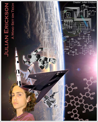
What's On Your Mind

What’s On Your Mind is the name of this project. The objective is to display what you generally think about by making an image of objects coming out of your head.  The objects are for symbolizing your thoughts. I like making things in general and I think about various projects all the time. My favorite projects always have do to with technology so I created an image with Photoshop to displayed example of scientific and engineering achievements coming out of my head. I added a background that fits the theme and to top it off I added some diagrams of a computer circuit and the structure of a molecule and my name with a caption. After I got images to use from the internet I had some trouble cutting them out from there background to add to my images but other than that the project went smoothly. I’m satisfied with the finished product.  


Wednesday, October 20, 2010


I made two versions of an image for a “silhouette design” project. This is the second version and it’s the one I choose to turn in for the project. The objective was to past a three pictures of you onto a custom background in Photoshop. Make two of them silhouettes and use different brush designs to fill in the background and the silhouettes. Another requirement was to choose a color scheme and apply it correctly. After I added the pictures of me and made the two into silhouettes I downloaded Photoshop brushes and fill in the background with them and the gradient tool. I also used the gradient tool to fill in the silhouettes. The color scheme that I first choose was fine but it looked to colorful to me so I made a deferent version that is black and white with some blue. I think the second one could be better, but I’m happy with it.
The top one is the first version and the bottom is the second.


Tuesday, October 19, 2010

Famous for 15 Minutes

This is not much more than practice with altering colors with Photoshop. This is for a project called “Famous for 15 Minutes”.  The objective was to use a image of yourself and change its color in four different copies to fit specified color scheme that my teach presented. Though I had to use certain types of color schemes I got to choose the exact colors. It was a rather boring project that didn’t take much time or work, but I learned from it.

Bottle Cap


Here is an image I did for a class project.  It’s designed to be printed and pasted in the inside of a bottle cap. Originally my teacher expected me to get images on the internet and then put them together as my own image but I drew the whole thing on Photoshop instead. It wasn’t a difficult process to draw. It did take a lot of erasing and redrawing because I had trouble deciding how I wanted it to look. The objective of this project is to design an image to be printed and pasted in the inside of a bottle cap. The requirements are that it needs to resemble a heart, it needs a banner, and it needs to say something on the banner. I could have came up with something more clever than “Friends” but I made it to give to a friend so I wanted to keep it simple with its original meaning.

Tuesday, September 21, 2010

This is just a exercise project to learn different filters in Adobe Photoshop. I copied a image from someone else so no credit goers to me for this picture.

Thursday, September 16, 2010

Layer Styles

This is not art. It's just a porject I was given in class. The goal is to greated 36 different layers in Adobe Photoshop. Each one must have letter on it and the same letter with diferent layer style settings to make each one look different. So first I tried each style by itself then I started combining them when I ran out of orginal layer styles. This was generaly a boring project but I am more aware of the different efects I can add to a image.

Wednesday, September 15, 2010

      Here is a self portrait of me I made for a project in my digital art class. The goal was to make a portrait of myself out of anything that can be found on a keyboard on Adobe Photoshop. It’s hard to tell but I did draw this picture by typing on Photoshop with a font that looks hand drawn. First I drew a picture on paper, just a basic sketch, typed and warped and moved the text on Photoshop. My design was inspired by anime. I’m happy with it the way it looks, though I simplified my original drawing to make it easier to draw with text. I didn’t really have too many problems with making it unlike my first Photoshop project because I know more about the program, but I still learned a lot more about Photoshop.

Tuesday, September 14, 2010

Railroad Crossing Parity Sign

This is a parity sign of a railroad crossing sign i made in my digital art class. If you can't tell its a pickture of a railroad crossing a road on foot. Its not that creative at all but its my first one.
This is the finished image I made using Adobe Photoshop. The project goal was to make a sign that is a parity of already existing sign and to make it funy, interesting or just to make you think. I looked at normal signs on the internet to see what there was to make a parity of. This idea just kinda popped into my head so I copied a railroad sign to photoshop and changed it to this by drawing over it.
I had a lot of problems doing this project because I didn't know anything about Photoshop, but I asked the teacher probably about an outrageous amount of questions about the program and I figured it out.
I'm happy with the way the image looks now, but It could have been more of a interesting idea.